Note
Click here to download the full example code
Introductory example - Finding Model Data 
Often you are interested in plotting data relevant to a model. For example, for some kind of clustering that maintains a group of centroids, you might want to generate a plot of those centroids.
from river import feature_extraction, cluster, stream
from sklearn import datasets
import numpy as np
import matplotlib.pyplot as plt
Here we want to generate a clustering and view the centroids. This is a static visualization because the plot will not change in real time.
model = cluster.DBSTREAM()
dataset = datasets.load_iris()
for x, _ in stream.iter_sklearn_dataset(dataset):
   model.learn_one(x=x)
We will run all the points through the prediction first to force populating the clusters.
for x, _ in stream.iter_sklearn_dataset(dataset):
   model.predict_one(x=x)
When you want to find centers for a cluster model, they will usually be at
models.centers. If you have a pipeline, you will need ot look at
model.steps
and index your model name (e.g., DBSTREAM) to find the same.
centers = model.centers
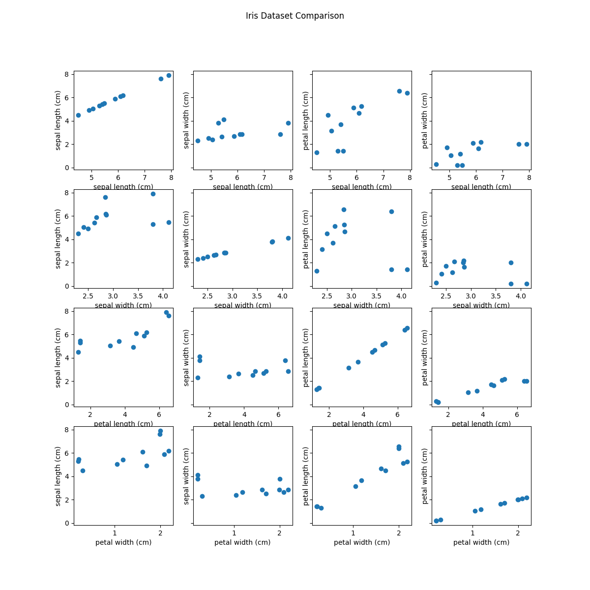
Here is the most basic example of choosing two features and plotting them against x and y. You could also use TSNE and UMAP (provided in other examples) to map the centers to a lower 2D space and do the same.
features = ['sepal length (cm)', 'sepal width (cm)', 'petal length (cm)', 'petal width (cm)']

# Prepare subplots!
fig, axs = plt.subplots(4, 4, figsize=(12, 12), sharey=True)
idxs = [(i,j) for i in range(4) for j in range(4)]

for f1 in features:
    for f2 in features:
        x = [d[f1] for _, d in centers.items()]
        y = [d[f2] for _, d in centers.items()]
        idx = idxs.pop(0)
        axis = axs[idx[0]][idx[1]]
        axis.scatter(x, y)
        axis.set_xlabel(f1)
        axis.set_ylabel(f2)

fig.suptitle('Iris Dataset Comparison')
fig.show()

print('This example shows plotting each of sepal width/length against petal width/length!')

Out:
This example shows plotting each of sepal width/length against petal width/length!
Total running time of the script: ( 0 minutes 2.588 seconds)